Rebranding
Naming | Brand Strategy | Logo | Signage | Campus Design | Collateral | Website
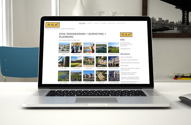
RSA+

How we did it:
Naming
Riechers Spence & Associates had been informally calling themselves RSA for a number of years, but when the new owners took over, they thought it was time for a permanent name change.
Discovery
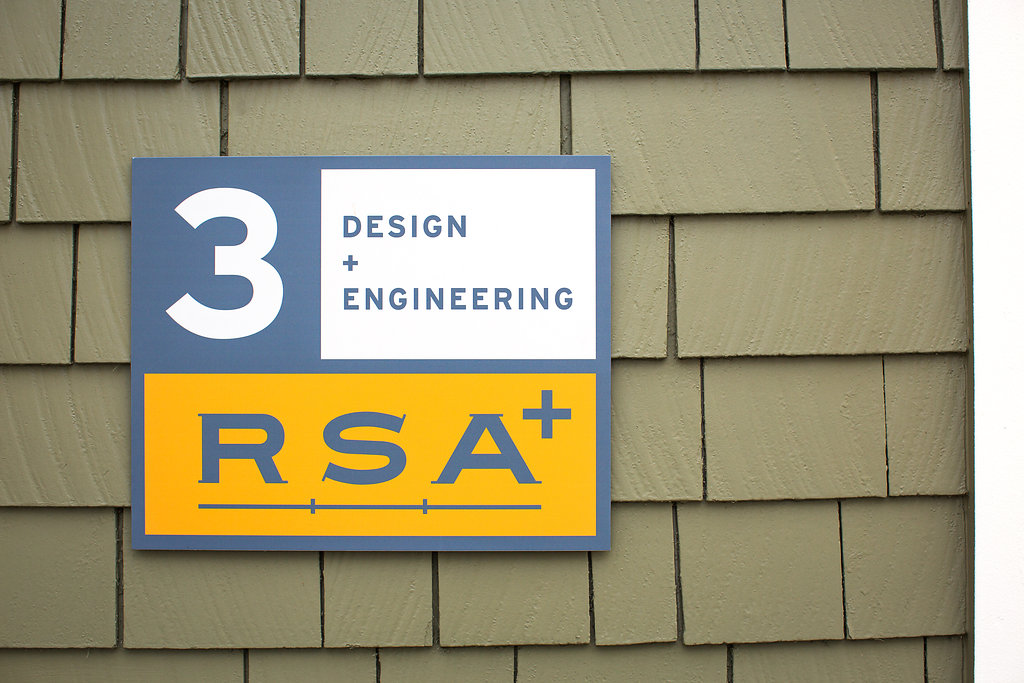
RSA had recently acquired a surveying company and had been working on some innovative, ground-breaking, patent-pending ideas and continues to excel in their industry. RSA takes pride in the fact that they are innovators, so adding the "PLUS" to their name made sense. Riechers Spence & Associates, Civil Engineers and Surveyors, became RSA+.
Branding
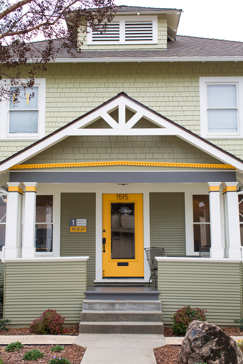
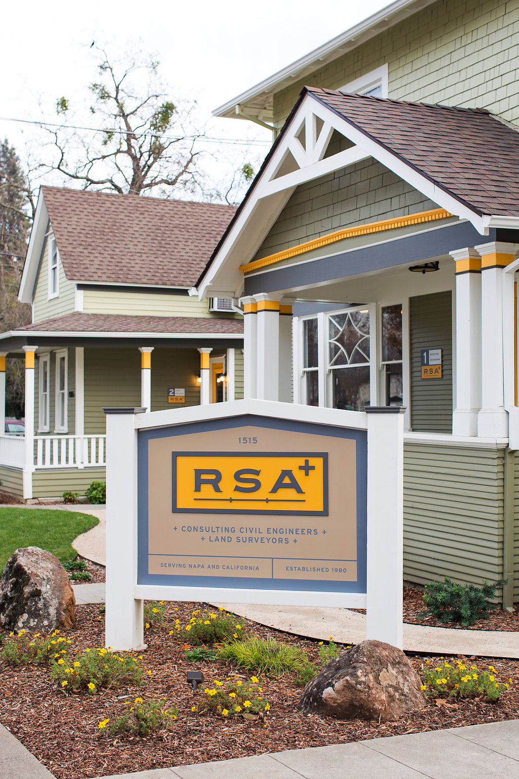
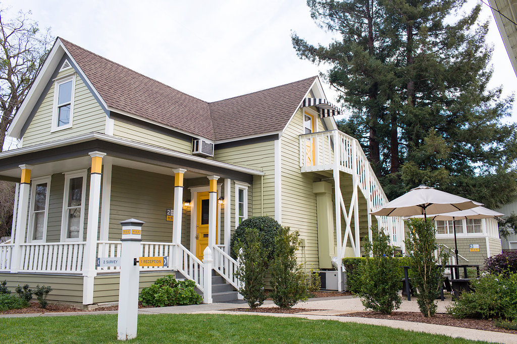
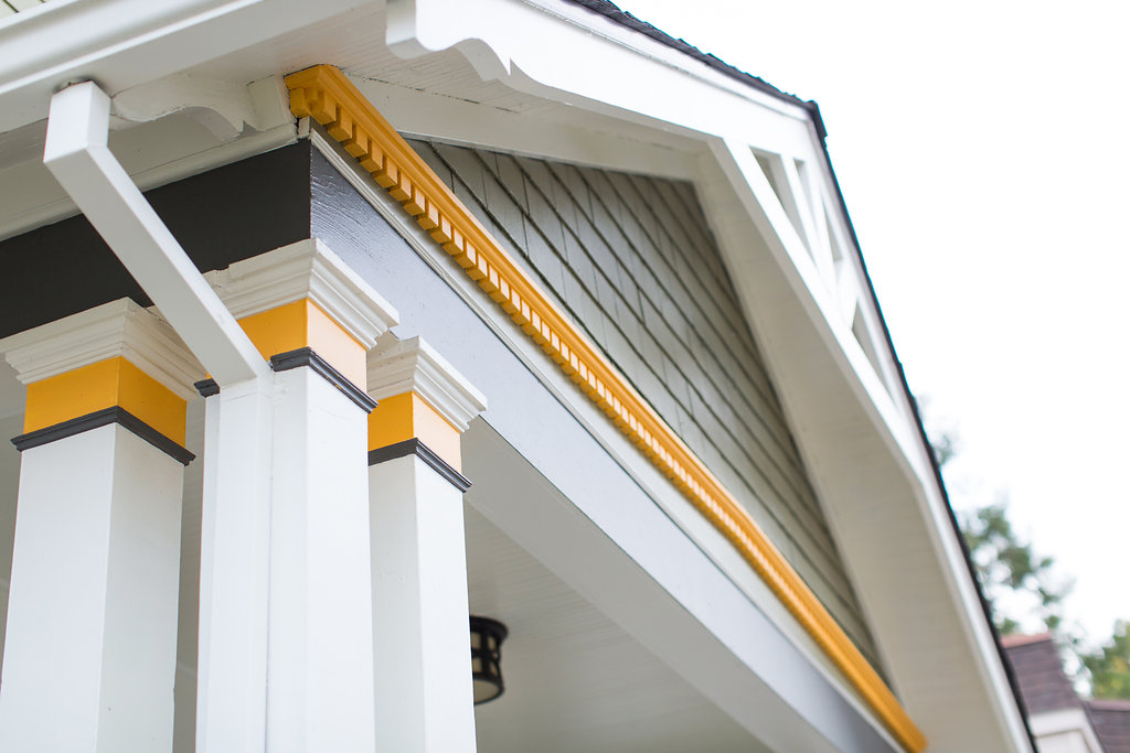
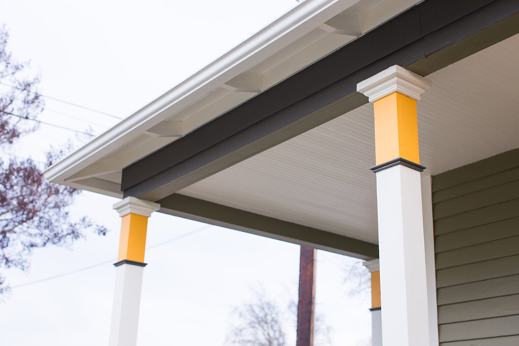
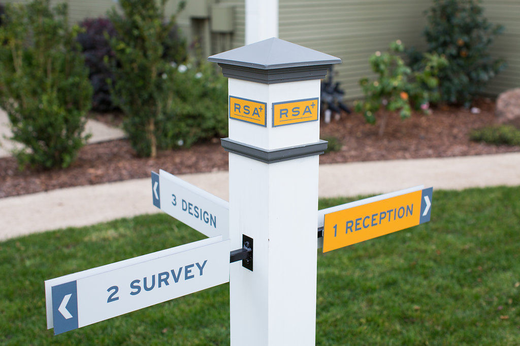
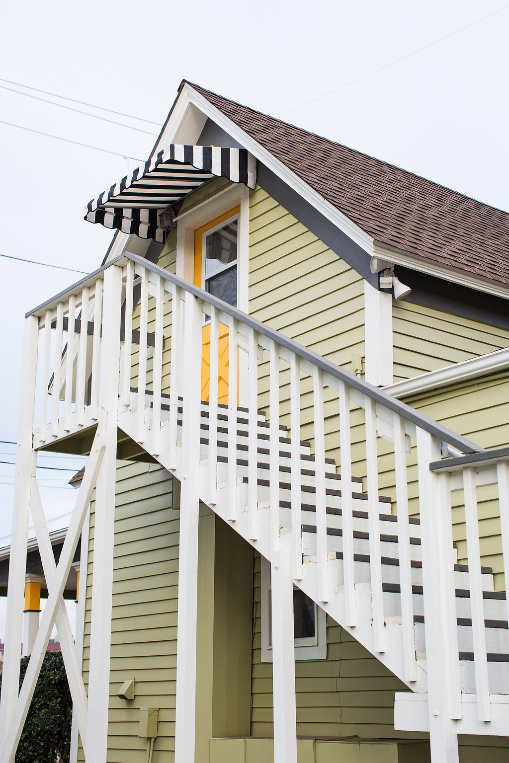
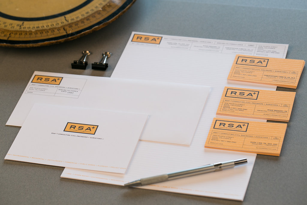
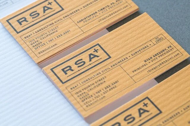
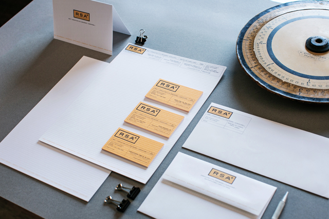
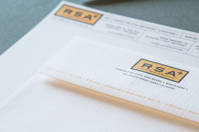
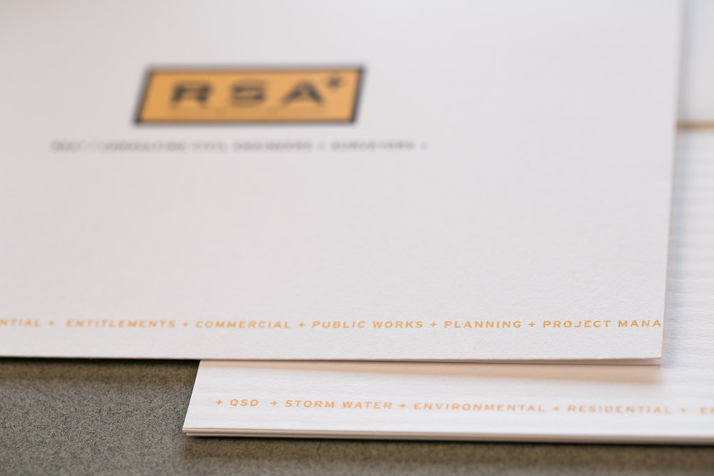
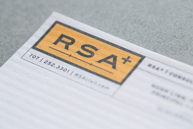
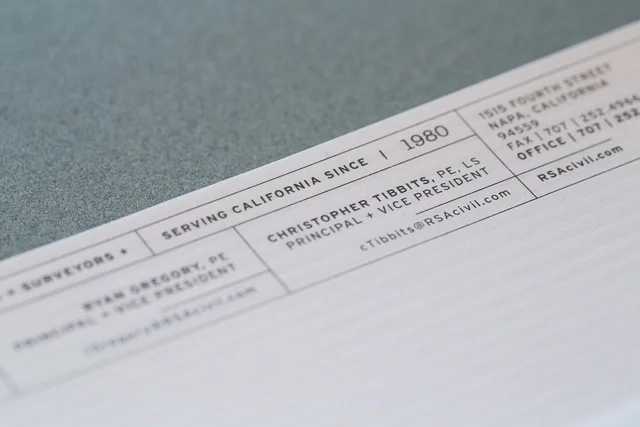
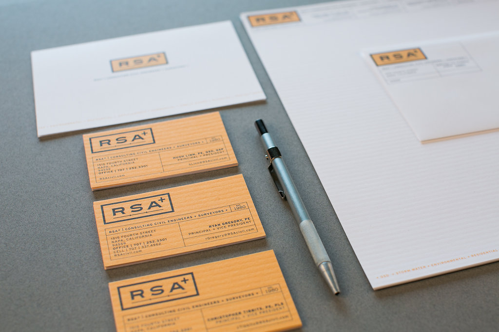
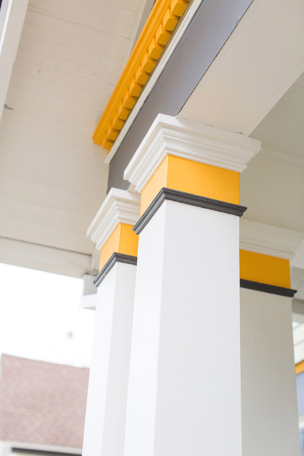
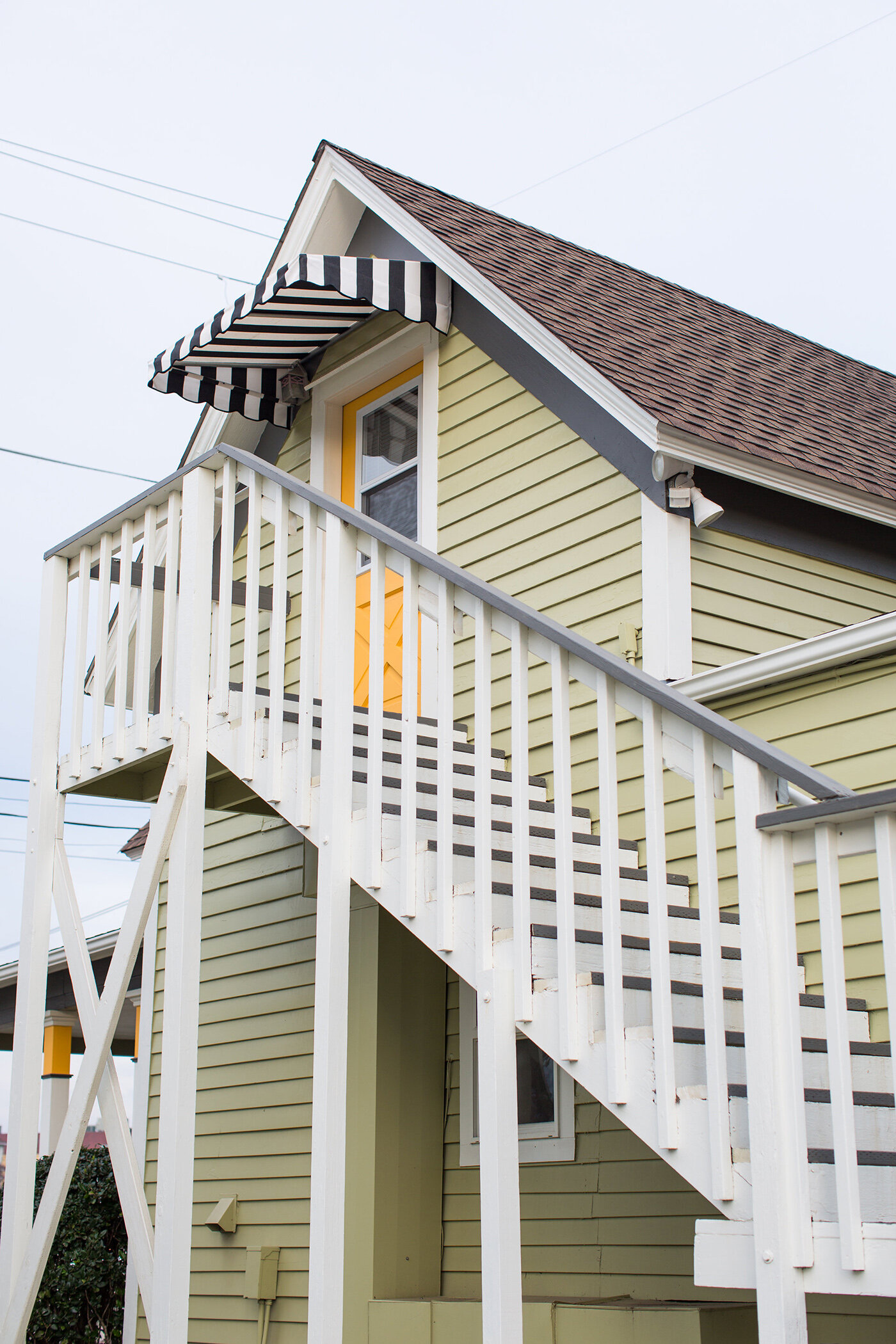
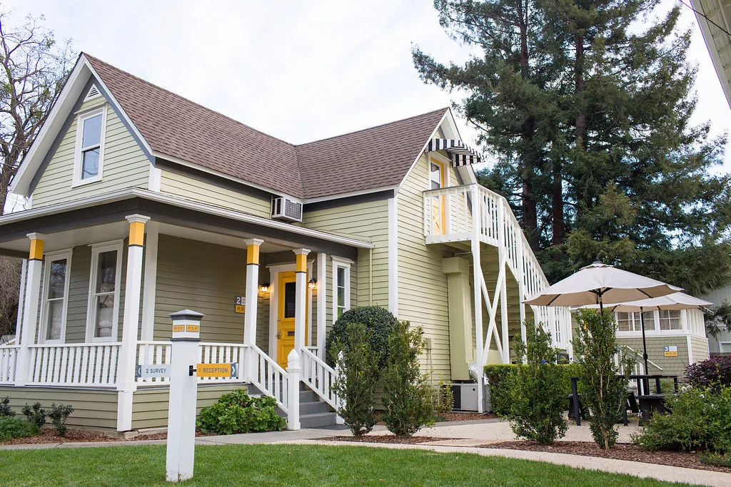
Color helps unify the RSA+ brand. The bold yellow is striking on the printed pieces and signs. The yellow, as an accent color on the buildings highlights the unique architectural details.
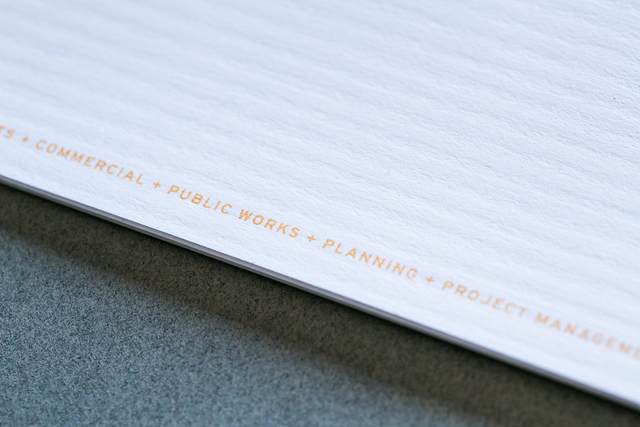
The business papers, including letterhead and business cards, are printed on a paper that has column texture, which is a perfect match for the engineering industry. The design is inspired by a “Title Block Border” found on engineering plans. The company’s capabilities listed along the bottom of the papers enforces the "plus" and has resulted in “ I didn’t know you also do ……!”
Environment Design
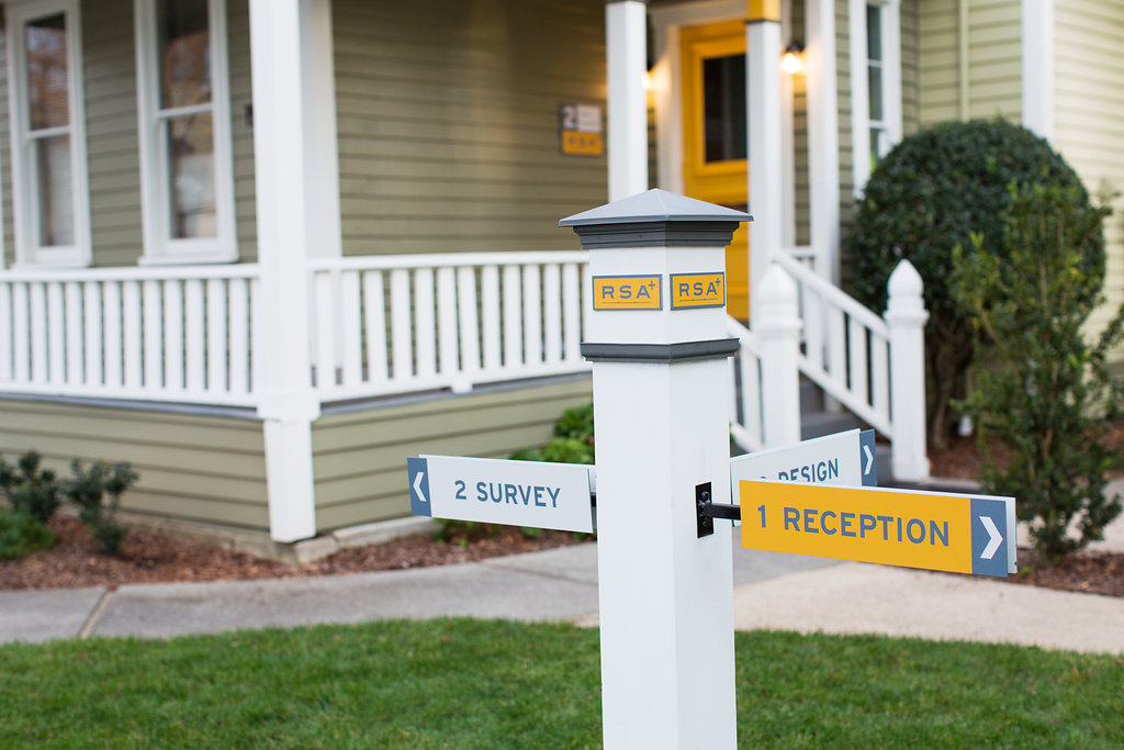
RSA+ needed to downsize by moving from a large Victorian building, into 3 smaller buildings. Linn Design Studio's task was clear: assure clients, community and staff that RSA+ was strong. So, we branded the buildings together with the corporate colors to create a campus feel, updated landscaping and added a picnic area and signs. The result, “I didn’t know those were all your buildings!” and “Now THAT’s how to renovate old buildings.”

BEFORE the REBRAND
AFTER the REBRAND