Joya
Brand Strategy | Wine Label Redesign | Logo Design
Joya Wine Company
Is your packaging top shelf worthy in the eyes of your distributor?
You’re not only selling to your customer, you’re selling to buyers, sales people and distributors.
The Problem
Russel Joy had an existing label but had plans to bottle a higher quality Cabernet Sauvignon in his next vintage and it would need to sell for a higher price.
Joya Wine Company's distributor wasn’t convinced that he could sell the higher priced wine in the existing package so, the distributor suggested that a better label would help sell the Joya wine at the new, more expensive, price point.
The Strategy
Reflect the family’s Sicilian Roots
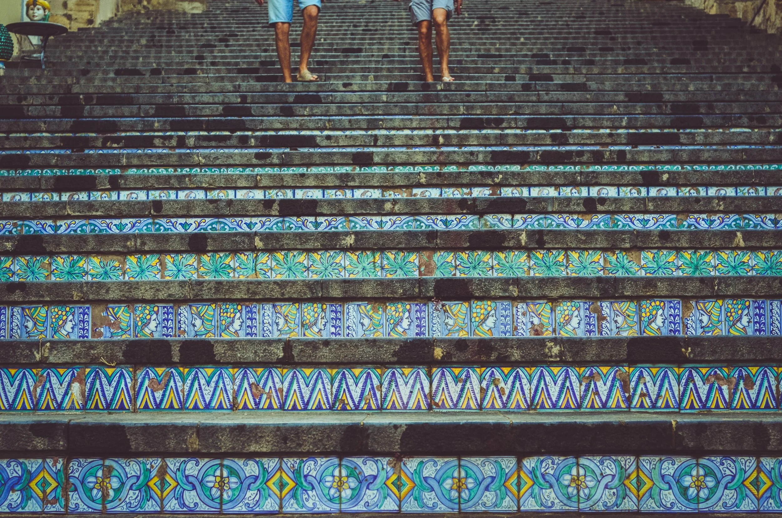
When the Gioia family (pronounced JOY-A) emigrated from Sicily, Italy to the United States, they simplified the family name to JOY. During the research phase of this project, we went back to the homeland of Sicily where the Gioia family originated, and found the Caltagirone Steps which became the inspiration for the label.
They completely sold out!
Results
They completely sold out!
The wine label redesign resulted in a package that the distributor could get behind: An elegant and appropriate label which reflects the delicious wine inside. They sold out of the first vintage. I guess that distributor was right!
Design Notes:
We kept the prominent “J” from the original label but added character and refinement thus making it unique to Joya and very upscale.
The Caltagirone Steps in Italy brought inspiration, texture and place when the image was added to the background with subtle embossing.
In their words ….
“I presented the wines to some of the distributors in Upstate New York and sold it all!”
The inspiration for the Joya Wine Label | Photo by Camille Minouflet on Unsplash


